#1 알고리즘
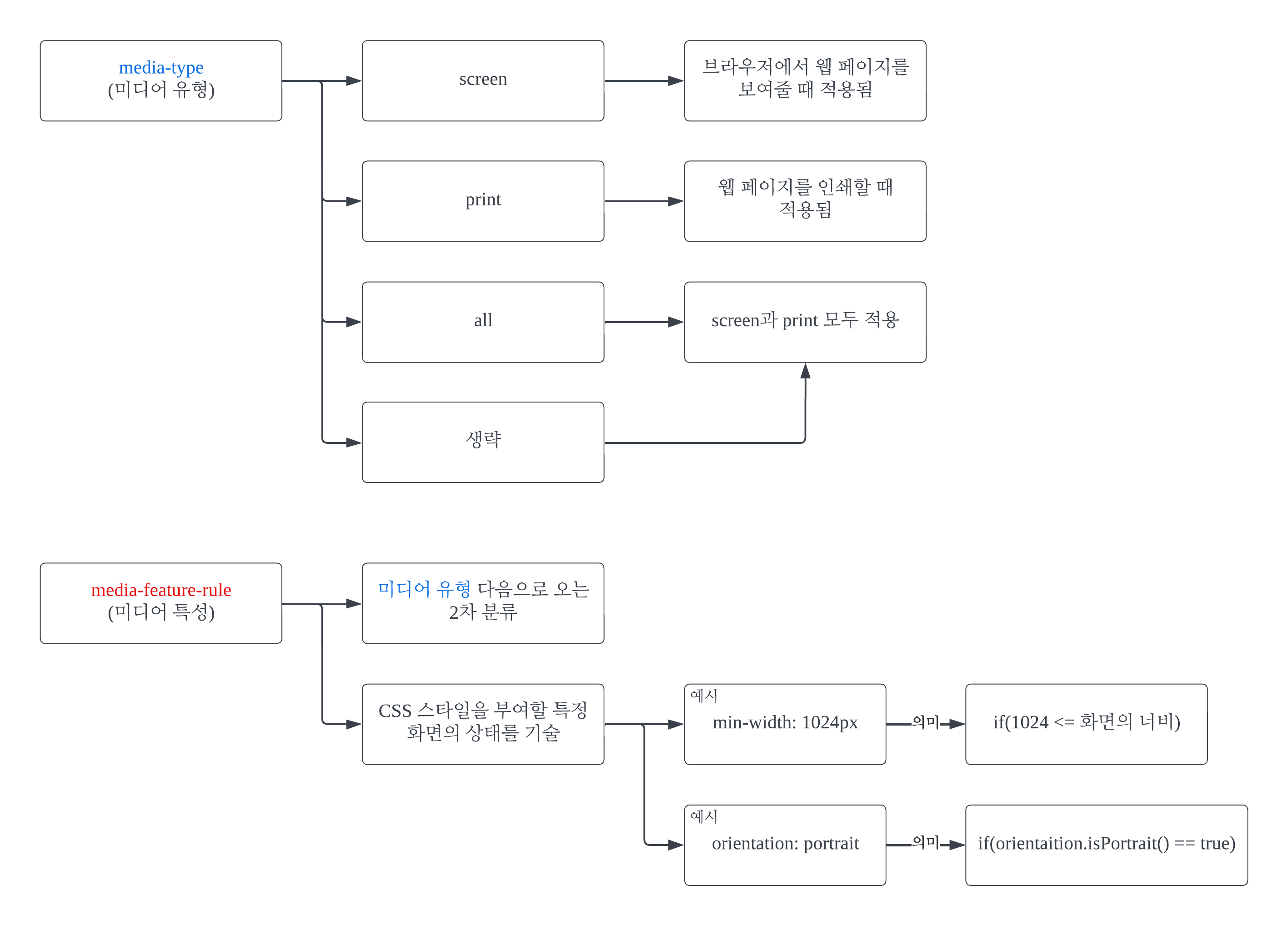
#1-1

화면 크기의 다양성을 고려한다는 말이 꼭 다른 플랫폼끼리의 다양성만을 의미하진 않는다. PC에서 웹 페이지를 볼 때 인터넷 창을 최대화해서 보지 않고, 예를 들면 화면 좌우 각각에 폭을 줄인 인터넷 창을 하나씩 켜 놓은 경우가 있다. 이때, 그에 맞는 적절한 동작을 미디어 쿼리가 수행할 수 있다.
#1-2
#2 코드
#2-1 HTML
<!DOCTYPE html>
<html lang="ko">
<head>
    <meta charset="UTF-8">
    <meta name="viewport" content="width=device-width, initial-scale=1.0">
    <title>미디어 쿼리 (Media Queries)</title>
    <link rel="stylesheet" href="./media-queries-practice.css">

</head>
<body>
    <div id="myBox">
        <h2>Media Queries</h2>
    </div>

</body>
</html>
#2-2 CSS
@media screen and (max-width: 767px) { /* width <= 767*/
    body {
        background-color: beige;
    }

    #myBox {
        background-color: yellow;
        text-align: right;
        font-size: 20px;
        font-style: none;
        transform: scaleY(-1);
    }
}

@media screen and (min-width: 768px) and (max-width: 1023px) { /* (768 <= width) and (width <= 1023) */
    body {
        background-color: brown;
    }

    #myBox {
        background-color: rgb(201, 112, 112);
        text-align: center;
        font-size: 30px;
        font-style: italic;
        transform: none;
    }

}

@media screen and (min-width: 1024px) { /* 1024 <= width */
    body {
        background-color: burlywood;
    }

    #myBox {
        background-color: green;
        text-align: left;
        font-size: 40px;
        font-style: none;
        transform: none;
    }
}

@media print {
    body {
        background-color: greenyellow;
    }

    #myBox {
        background-color: coral;
        text-align: center;
        font-size: 50px;
        font-style: italic;
        transform: scaleX(-1);
    }
}
#3 웹 페이지
media-queries-practice.html
0.00MB
모든 코드를 하나의 파일에 합쳐 넣었다.
#4 요약
미디어 쿼리를 통해서, 화면 크기 파편화에 UI적으로 대응할 수 있다.
'깨알 개념 📑 > 기타' 카테고리의 다른 글
| API (Application Programming Interface) (0) | 2023.12.18 |
|---|---|
| API, Framework, SDK, Tool, Project, Architecture, IDE, Library, Package의 관계 (2) | 2023.12.12 |
| [Java] 설치, JRE와 JDK의 차이, 환경 변수 설정 (2) | 2023.12.08 |
| display 속성 값 block, inline, inline-block의 차이 (0) | 2023.12.06 |
| [Java] Map<Key, Value>의 Key 자리에 원시 타입(Primitive types) 데이터 형식이 올 수 없는 이유 (0) | 2023.10.30 |